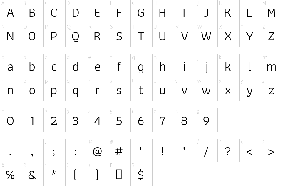
Athiti is a Thai word for the Sun, and it is an informal sans Latin and loopless Thai typeface. The friendly personality is based on humanist calligraphy, and has an organic look and feel while preserving the traditional construction of Roman type. It all started with a desire to learn more about the origin of strokes in human handwriting. It is designed to reflect a trace of writing tools and convey its inspiration. The family consists of 6 weights that can be used in headlines or body text.
The outer curves contrast with the angled inner counter shapes, which distributes feelings of strength and softness at the same time. Athiti can be used with a mixture of formal and informal content, for example in educational work.
A similarity between some glyphs such as ก ถ ภ ฤ ฦ, ฎ ฏ, บ ป, or ข ช is something to take into consideration because it might lead to confusion when typesetting very short texts. A specific approach has been taken for dealing with thick and thin strokes in the Thai design. Other type designers may consider this font as an example when developing new fonts.
Informal loopless Thai typefaces have slightly simplified details, as compared to the formal looped style, and this allows type designers to extend loopless families to very black weights. Sizes and positions of vowels and tone marks need to be managed carefully because they are all relevant to readability, legibility, and overall texture. Also, in this case, ink trapping is required when connecting two specific strokes of each glyph, and it has to be done carefully, as it has been in Athiti.
The Athiti project is led by Cadson Demak, a type foundry in Thailand. To contribute, see
https://github.com/cadsondemak/athiti 
| nom de fichier | taille du fichier | type | options |
|---|
| Athiti-Medium.ttf | 178 KB | Font File | Télécharger |
| Athiti-ExtraLight.ttf | 171 KB | Font File | Télécharger |
| Athiti-SemiBold.ttf | 181 KB | Font File | Télécharger |
| Athiti-Regular.ttf | 183 KB | Font File | Télécharger |
| OFL.txt | 4 KB | Text File | view |
| Athiti-Bold.ttf | 182 KB | Font File | Télécharger |
| Athiti-Light.ttf | 174 KB | Font File | Télécharger |
