I always been attracted to condensed typefaces, and one of the first I came across was Empire, designed by Morris Benton Fuller for ATF in 1937. I first spotted it in an architecture book at my college's library while doing homework.
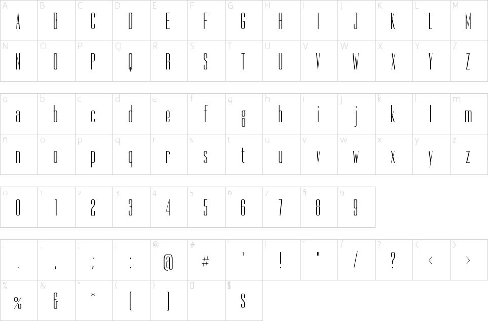
Dorsa is a modern interpretation of Empire with some personal details. When I start sketching I knew it would be a little less condensed than the original Empire because I wanted it to be used for use in titles, and combined with positive letter spacing it gives an elegant look to text. Although the original hasn't got a lowercase, I studied a lot of skyline typefaces and drew a fully original lowercase.
I started with lowercase “o”, which isn't completely geometric, it is expanded to the outside, keeping the same whitespace through all weights. And this repeats all over the typeface, because the construction of all the characters was modular, based on that “o”; the “f” is designed to not meet any of the diacritics; and uppercase “A” has a traditional form, because I think this is more legible.
| nom de fichier | taille du fichier | type | options |
|---|
| OFL.txt | 4 KB | Text File | view |
| Dorsa-Regular.ttf | 20 KB | Font File | Télécharger |
| Nom du concepteur: |
Santiago Orozco |
| Licence de polices: |
Domaine public, GPL, OFL |


