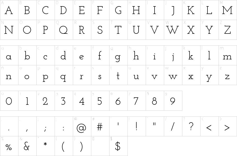
Josefin Slab was the first typeface–at least in my mind–I designed! But I decided to start simple with Josefin Sans. Following the 1930s trend for geometric typefaces, it just came to me that something between Kabel and Memphis with modern details will look great.
I wanted to stick to the idea of Scandinavian style, so I put a lot of attention to the diacritics, especially to "æ" which has loops connecting in a continuous way, so the "e" slope was determined by this character.
It also has some typewriter style attributes, because I've liked the Letter Gothic typeface since I was in high school, and that's why I decided to make a Slab version of Josefin Sans.
| nome do arquivo | tamanho | tipo | opções |
|---|
| JosefinSlab-Italic.ttf | 113 KB | Font File | Baixar |
| JosefinSlab-BoldItalic.ttf | 42 KB | Font File | Baixar |
| JosefinSlab-ThinItalic.ttf | 193 KB | Font File | Baixar |
| JosefinSlab-LightItalic.ttf | 156 KB | Font File | Baixar |
| JosefinSlab-SemiBoldItalic.ttf | 140 KB | Font File | Baixar |
| JosefinSlab-Light.ttf | 111 KB | Font File | Baixar |
| JosefinSlab-Bold.ttf | 86 KB | Font File | Baixar |
| JosefinSlab-Thin.ttf | 195 KB | Font File | Baixar |
| JosefinSlab-Regular.ttf | 108 KB | Font File | Baixar |
| JosefinSlab-SemiBold.ttf | 99 KB | Font File | Baixar |
| OFL.txt | 4 KB | Text File | view |


